36
The Story Behind Antonio's Tale
Information and rationals on creating a simple interactive IDPF ePub3 Fixed layout performance and feature demonstration book. Modified: 2013-01-05
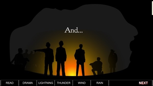
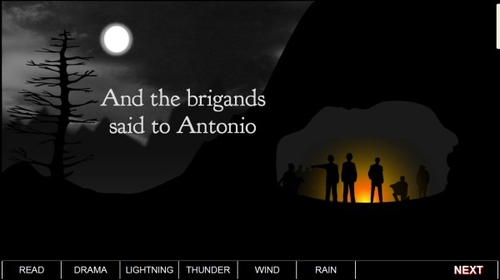
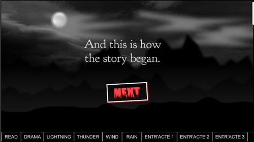
One of the motives for creating Antonio's Tale was the fact that it was a no-spread interactive landscape book that needed independent page presentation for the story to work. The required engagement experience is one viewport/page at a time.
The story also requires a reading system to respect page independent interactive and CSS animation features such as animation on-page-entry to create the correct reading experience.
Although these issues were covered in our Fixed Layout test books, Antonio's Tale gives the requirement some real-content context.
The IDPF fixed layout spec does not give any information about page loading methods (and it probably shouldn't). If any reading system developer has had some experience with interactive content of any type they will be aware of this. If not, this is an early attempt to bring this up as real issue for other developers of ePub3 reading systems.
Antonio's Tale can be downloaded from the AZARDI ePub3 Samples page. Go to the ePub3 Sample Books Page ➤. Don't forget to Download and install AZARDI 17 if you don't already have it.
There is more background information in the Infogrid Pacific blog article.
Other Reading Systems
We have noticed in both iBooks and Readium ePub3 fixed layout designs that events that happen on page entry, or exit are not controlled by the page presentation navigation or even at book loading time.
Currently Readium fires off all on-page-entry events on book loading. That means by the time you get to the page the animation is over. It also means don't use Readium, or don't use on-page-entry events (which is sad). It also doesn't allow the optimization of viewport size for the browser at present, but that is on their "to-do list". Readium is still a work in progress in this area. Page entry/exit control is definitely a technique that is required in educational material.
Although the new iBooks ePub3 fixed layout implementation appears to present landscape pages one at a time, behind the strings and mirrors they are still arranged as the old page spreads so the right page fires while the left one is visible. It also means two pages are loading at the same time. This is too much work for an iPad! It also can't play more than one audio file at a time so the exciting remix audio features of Antonio's Tales are out the window.
Demonstration Features
- Vanilla epub3 fixed layout with landscape, no-spread but with items hidden by the spine.
- Large CSS animation on page entry.
- CSS animation triggered by a user (Javascript) event.
- Multiple audio files triggered by the user.
- Javascript animated sequence.
The Design
Antonio is a simple landscape-locked, no-spread fixed layout book. There are no fixed-layout spine properties. Story pages 2-8 have the spine as linear="no" because we want the user to engage using the story internal navigation strategy.
<meta property="rendition:layout">pre-paginated</meta>
<meta property="rendition:orientation">landscape</meta>
<meta property="rendition:spread">none</meta>
All pages are 1366px X 768px. They could probably have been half that size, but now that AZARDI supports fixed layout we are designing for the average desktop.
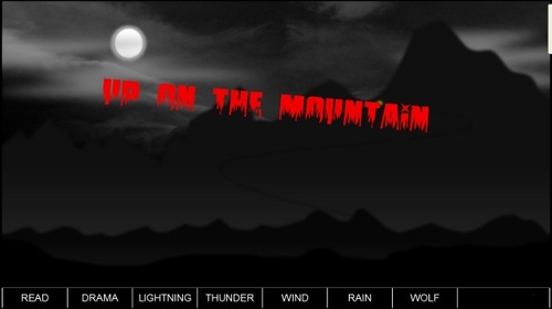
The objective was to have a number of CSS animations both on-page-entry triggered and a combination of visual and sound effect that areuser event triggered. We decided to keep the on-page-entry animations to just three page, and this was limited to the moving landscape and floating clouds.
Most of the images are PNGA so are pretty big once opened in memory in any device. That makes a full screen image around 4.19MB in memory. That means it couldn't be loaded to the iBooks store.
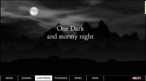
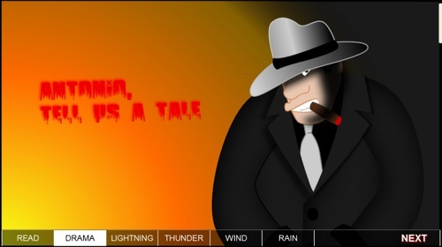
Antonio's Story is meant to be a little scary in a friendly sort of way. The biggest user feature is story audio-effects self-mixing. As the reader progresses through the story, they can listen to it being told in different ways and add their own sound effects at any time.
CSS and Artwork
OK the artwork isn't great, but it was a spare time work of love. Because the book relies on image transparency a lot nearly everything is PNG, and a lot PNG-Alpha (PNGA).
The artwork was designed to fit with the CSS requirements in this particular little interactive book.

Probably the neatest little trick in the book is the rain. This was created from one drop which was turned into a small background image using the Inkscape random clone features which gave enough variety in the drop size focus and blur to make the rain look reasonably random. This was then manipulated using a CSS animation moving the tile down and to the left. OK I admit it may look more like hail or snow unless you are squinting, but the soundtrack is undeniably rain, so the illusion is created.
The background is transparent and the blue put in here so the details can be seen.
Here is the CSS. The .rain-fall class is injected into the <div> when the user clicks the [ RAIN ] button. It's also resized and the opacity has been fine tuned for the required effect.
/* Rain fall ================= */
.rain-fall {
 width: 1366px;
 height: 768px;
 position: absolute;
 top: 0px;
 left: 0px;
 background-image: url("*/rain2_online.png");
 -webkit-background-size: 20% 20%;
 background-size: 20% 20%;
 /* ANIMATION */
 -webkit-animation-name: rain;
 -webkit-animation-duration: 1s;
 -webkit-animation-timing-function: linear;
 -webkit-animation-iteration-count: 15;

 animation-name: rain;
 animation-duration: 1s;
 animation-timing-function: linear;
 animation-iteration-count: 15;
 opacity: 0.3;
 z-index: 20;
 }
@keyframes rain {
 from {
  background-position: 0px 0px;
 }
 to {
  background-position: 0px 200px;
 }
}
@-webkit-keyframes rain {
 from {
  background-position: 0px 0px;
 }
 to {
  background-position: 0px 200px;
 }
}
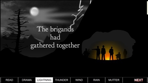
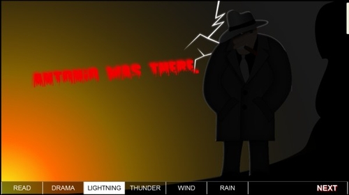
The other quite effective and modest use of CSS animation was Page 5 when the Lightning button gives both the flash and lights up our hero Antonio. This is of course two images working together in a CSS animation and the speed at which it happens is a balancing act.
Finally there is the rather exciting gun-shots animation on the Colophon page when you click "Antonio's Message". This was done with a single screen bullet-hole image (Inkscape vector to PNGA) and the AZARDI Interactive Engine animation module for the timing.
Sound-Effects
Sound effects was the heart and soul of Antonio's Tale, the idea being to use different combinations of sounds on each pass through the tale.
Discovering and selecting sound-effects and music is always a time consuming job. You have to listen to dozens of tracks before you make a selection.
Of course all audio was mixed and edited with the awesome Audacity, the premier open source audio editing program. It was then saved as both MP3 and OGG/WebM audio so it would be available on all platforms.
Balancing the levels so five sound-tracks could play simultaneously needed a bit of fine tuning, and the rain track is still a bit loud.
All audio special effects and music were sourced from the wonderful and creative folks at www.freesfx.co.uk.
Outcomes
Other than the fact that Antonio's Tale was a bit of fun to make and a lot of fun to engage, there are lessons to be learned, or perhaps more correctly - relearned!
Because we were not targeting iBooks the expected iPad operational failures occurred. What this very simple interactive fixed-layout ePub3 did was reinforce the incredible limitations of iBooks very partial fixed-layout and rich media implementation. Even in 2013 little has changed. You have to design down for iBooks, can only use 20% of the Fixed Layout features, and have to significantly limit interactivity. Interestingly it loads and displays well on our Android readers.
We will probably do a reworked version with the background images half the size and make a few other modifications to give Apple tablets a fighting chance. But the audio self-mix feature will be DOA for a while.
An iBooks recommendation is to use individual page CSS. We are not sure this should be an issue, however we are updating IGP:Digital Publisher to package fixed layout books with individual page CSS to see how much that affects performance. It will be interesting to see if image loading is any better on iPad with this approach. It currently loads OK onto Android devices.
Now that we have AZARDI fixed layout as a reference for a thorough exploration of the IDPF Fixed Layout Spec (with more page layout options than is healthy) we will continue the learning curve.
It would appear that fixed layout books will have to be dumbed down for some time to come if they are being released on iBooks.
A fortunate feature of IGP:Digital Publisher is Design Profiles. This allows common XHTML to be processed with different CSS and other features so making multiple platform editions of a book is not such a chore. Obviously distributing them does still remain a pain.
The Book can be downloaded from the AZARDI ePub3 Samples page. Go to the Sample ePub3 Books Page ➤. Don't forget to Download and install AZARDI 17 if you don't already have it.

