APEX@IGP
10
Colour Photographs and Illustrations
Photographs and Rich Colour illustrations are the most straight-forward images to process. They will generally be treated as JPG with some image compression applied.Modified: 2014-06-09
Photographs and Rich Colour illustrations are the most straight-forward images to process. They will generally be treated as JPG with some image compression applied.
Use the standard height and width guidelines and apply JPG compression to the maximum possible for the image content.
Should You Consider High-Resolution Displays?
At the beginning of 2014 the short answer is no.
Most mobile devices have higher resolution displays than standard workstations, but even that is starting to change. The biggest advantage with high-resolution displays is for text rendering.
Where possible us CSS and SVG for gradients, borders, illustrations, charts, graphs, line-art and where-ever possible.
Do not currrently think about processing images for very hi-resolution displays (2X). Your file sizes go up by 4Xs and significantly bloats your textbook packages. It is a near future problem.
Just ensure in your production environment that images are processed at a suitably high resolution before processing for packaging.
AZARDI:Content Fulfilment will shortly handle packaging of images in the correct resolution for a device on package delivery.
Our general guideline for JPG processing is to apply compression until edge artifacts can just be seen at 1:1 size. Never evaluate images zoomed in.
Any JPG image has a compression sweet spot where the quality is good and the filesize is as small as it reasonably should be. Additional compression doesn't reduce the filesize significantly and just increases the compression artifacts.
The best technique is over-compress and then ease back rather than trying to sneak up on a suitable compression level.
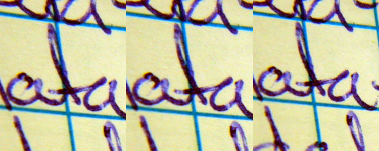
Here is an line image saved at 80 (161KB), 60 (113KB) and 40 (84KB) compression setting. The file size can be halved with no loss in picture information or value.
Image Presentation Options
If images are part of the instructional narrative they should always be presented in the content flow to the extent possible. The size of images should always be explicitly planned and created for the presentation technique being used.
There are a number of image presentation production tool options in IGP:Digital Publisher which match the presentation feature options of AZARDI. There are significantly more options than those available for most reading systems.
- Galley Width Image. Image is set at galley-width and interrupts the text flow as in a print book.
- Side Floated Image. Image is floated to the left or right as a percentage of the page width. Text flows past the image.
- Images in a Sliding Panel.
- Image as Thumbnail. Image is presented as a thumbnail that when tapped expand to larger images in the reading systems image viewer.
- Image in a Reveal Panel. Image is presented in an expanding inline panel that can be opened and closed.
- Image in a Scrolling Panel. Image or set of images are placed inside a panel widget and explored by scrolling X, Y or X and Y.
- Image With CSS Background. The image is inserted by CSS into an HTML objects' background. This is unavailable for opening in the reader image viewer.
- Image in a Pop-up Panel. Image is presented in a pop-up window which substantially takes over the viewport. ThePop-up can be opened from text or a thumbnail. This technique is useful when the image has more detail that requires attention.
These presentation options are illustrated and explained further below.
The production process is to make the image as large as required to deliver the information within the context of the image presentation method choosen. The size option is highly dependent on the page flow-type and the size of the image.
Producing Print and Digital in IGP:Digital Publisher
You can produce both print and digital books using the same IGP:FoundationXHTML content.
Image processing is of course very different for the two delivery packages and this takes considerable image production planning.
This will be addressed in a future tutorial.
1. Galley-Width Image
Suitable for: Reflowable/Scrolling. Landscape/Portrait orientation
The image resizes to the full width of the viewport regardless of orientation. Because this technique is more or less imitating a print book it is most useful for landscape images in a portrait orientation. If the image is portrait you have to consider the maximum height rule.
This image is 1000px wide and is dynamically resized by the viewport.
This image will adjust it's width to fit the galley width irrespective of viewport size or orientation. You must size these images for the largest viewport width you are targeting.
This is not a good presentation method for single column reflowable pages in landscape mode with no pagination as the image can easily size-up larger than the viewport.
It is suitable for a Scrolling page in both landscape and portrait orientation.
Consider using the image centered on the galley with something like a 70% of width setting. This will make it usable in both portrait and galley orientations.
Here the image is 1000px high, but has been sized to
2. Side Floated Image
Suitable for: Reflowable/Fixed-Layout/ Scrolling. Portrait/Landscape
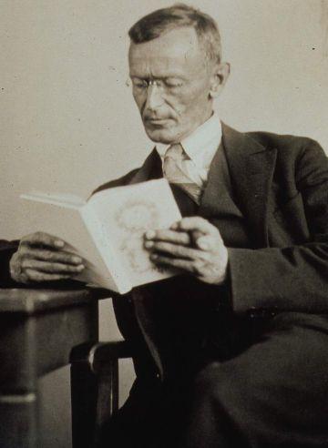
The galley float technique is useful for any content where the image should be seen in the context of the content flow and is illustrative or informative in nature.
Here we have used an image of author Herman Hesse. The image is only 370px wide as no larger source image was available. Because it is a context illustration and not part of the content it can be treated in size context. That means with a 1000px galley a good width is either 30% or 40% of the galley width.
Here we have used 30% of the galley width given. The image can still be tapped and opened in a image viewer if the students wants to see the image larger.
If you are using multiple float images on a page you have to consider if they will overlap on various viewport widths and position them in relation to the text accordingly.
3. Images in a Sliding Panel
Suitable for: Reflowable/Fixed-Layout/Scrolling. Portrait/Landscape
When you have a set of images that are illustrating one concept images in a sliding panel can be a useful tool.
The pedagogical considerations for this of course are that:
- other than the first image the other images are effectively hidden until the user slides the panel.
- The user only gets visual context for a single image at a time.

Image 1 caption goes here...
-
Image 2 caption goes here...
-
Image 3 caption goes here...
-
Image 4 caption goes here...
-
Image 5 caption goes here...
Widget panels are a fixed size irrespective of the behaviour of the viewport. Therefore they will behave accordingly.
When processing images for a sliding Panel Widget make them the exact size of the sliding panel. Do not make them larger and then use dynamic resizing unless you are expecting users to explore detail inside the images. However this is probably a counter-intuitive packaging strategy for textbook packaging.
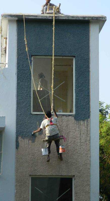
4. Image as Thumbnail
Suitable for: Reflowable/Fixed-Layout/ Scrolling. Portrait/Landscape
This example image is exploring workplace safety. The image is both awkwardly portrait and has supporting text that asks a number of questions about the image.
In the reading system you can give the instruction:
Click or tap on the image. Examine it and then answer the workplace safety point questions.
(In a browser you will have to right-click and open in a new tab or window).
Note in this option the icon is the full high quality image CSS resized. It then opens in the AZARDI (or other reading system) image viewer context. There is no additional production work required. This is a communication image so the size can be set to the standard dimensions. In this case the image is 1000px high.
This technique has been used very successfully with image heavy art books with explanatory captions. In these projects the requirement is to have the full size image as large as possible for exploration by the user using the tap-on-image viewer.
5. Image in Pop-up Panel
Suitable for: Reflowable/Fixed-Layout/ Scrolling. Portrait/Landscape
When you need to get the users attention totally focused on an image a Pop-up Panel does the trick. It has few benefits over other techniques unless the image has significant information that must be evaluated and explored, or some associated interactivity or other learning information provided.
Click Me. See the image in Pop-up glory
This image is 1000px wide and is dynamically resized by the viewport.
6. Image in Reveal Panel
Suitable for: Reflowable/Scrolling. Portrait/Landscape
Reveal Panels can be used very effectively with an instructional narrative. They can be used to expose more explanatory or complimentary information without interupting the presentation of the main lesson material. The reveal panel can be combined with text and other content as well including Question and Answer content.
Click Here to see the picture
7. Image in a Scrolling Panel
Suitable for: Reflowable/Fixed-Layout/ Scrolling. Portrait/Landscape
When the content is suitable a scrolling panel can be used rather than going to the reading system image presentation. The image can be presented at a relatively large size and the user then explores the image by scrolling X, Y or X-Y.
You can make the scrolling panel as large or small as you like. For example it could be on a stand-alone portrait locked, fixed-layout page that is not in the spine and that is linked to from the text.
Posted by Richard Pipe