APEX@IGP
31
Fixed Layout Page Sizes
How big should fixed layout pages be for various presentation environments and devices. Updated: 2013-06-15
Overview
It can be confusing to know what pixel sizes to make a page. Do I make it to match the interface pixel count; or something else? This is becoming even more confusing as device screen resolutions keep increasing.
The strange fact is actual pixels dimensions don't matter too much. What is important is the aspect ratio. That means width to height ratio for the viewports you are targeting.
Currently iBooks pretty much dominates the commercial Fixed Layout (FLO) ePub market and publisher thinking. However there is a lot of fixed layout content out there being delivered in private channels for education and training. Two notable examples are AZARDI:Content Fulfilment and Ingrams Vital Source both of which have to target multiple monitor sizes.
Up to a certain level the larger the FLO viewport page size the better. Of course the larger the area the bigger the potential image file sizes become and all mobile devices squeal if images are too big. That is why combinations of SVG and CSS should be used for as much design as possible. However even SVG is expensive on rendering and needs to be used thoughtfully if you are targeting CPU challenged devices.
So depending on whether your book is image, text or media oriented you will be making a size choice. If you are targeting online readers the limits are more about file transfer protocols and bandwidth.
This article gives some guidelines, not rules, that must be tempered with an understanding of limits where they exist.
Device Pixels and Resolution
Here is a little table to get your head around a range of current device screens and aspect ratios. Common laptop and monitor sizes are also included.
| Device | Aspect | Width | Height | PPI |
|---|---|---|---|---|
| iPad 1&2 | 4:3 | 1024 | 768 | 132 |
| iPad 2&3 | 4:3 | 2048 | 1536 | 264 |
| iPad Mini | 4:3 | 1024 | 768 | 163 |
| HTC 1 4.7" | 16:9 | 1920 | 1080 | 468 |
| Samsung 5" (Galaxy 4) | 16:9 | 1920 | 1080 | 441 |
| Samsung 5.5" (Note 2) | 16:9 | 1280 | 720 | 267 |
| Samsung Galaxy Tab 7" | 16:9 | 1024 | 600 | 149 |
| Samsung Galaxy Tab 8.9" | 16:9 | 1280 | 800 | 169 |
| Samsung Tab 10" | 16:9 | 1280 | 800 | 149 |
| Nexus 7" Tablet | 16:9 | 1280 | 800 | 216 |
| Nexus 10" Tablet | 16:9 | 2560 | 1600 | 300 |
| Kindle Fire 1 | 16:10 | 1024 | 600 | 169 |
| Kindle Fire HD | 16:10 | 1280 | 800 | |
| Kindle Fire HD 8.9" | 16:10 | 1920 | 1200 | 254 |
| Microsoft Surface RT | 16:9 | 1024 | 768 | 148 |
| Microsoft Surface Pro | 16:9 | 1920 | 1080 | 224 |
| FHD | 16:9 | 1920 | 1080 | 96 |
| WSXGA+ | 16:10 | 1680 | 1050 | 96 |
| WXGA(II) | 16:10 | 1440 | 900 | 96 |
| HD | 16:9 | 1366 | 768 | 96 |
| WXGA | 16:10 | 1280 | 800 | 96 |
| XGA | 4:3 | 1024 | 768 | 96 |
A selection of common screen specifications. Note that only pixel sizes are important for Fixed Layout design, PPI is provided only for interest.
iBooks
If you are targeting iBooks the screen has an aspect ratio of 4:3. In landscape mode each page in a spread is more or less 3:2. About the same aspect ratio as a 6in x 9in book. Apple's official page size for spreads, to make allowance for their paper chrome in spread view is 738px X 985px. This is a 4:3 aspect ratio page.
However with the side-by-side spread the aspect ratio of each of the two pages is 3:2. Therefore the pages should be 738px high X 493px wide. That is an OK size if you dont have a lot of text or layout to do. You should consider going to 1100px X 740px (approx 1.5 the natural size).
With the new IDPF fixed landscape and portrait support when designing for iBooks you can use the entire screen minus the 20px topbar. Here are some iBooks screen shots from the test books showing presentation of a 16:9 (Size: 1366px X 768px) aspect page and a 4:3 (2048px X 1024px) aspect page in an iPad.
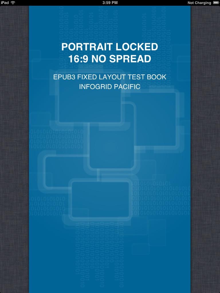
16:9 Fixed Layout, Orientation:Portrait, no spread
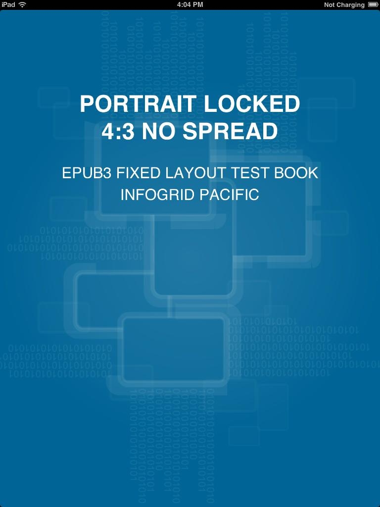
4:3 Fixed Layout, Orientation:Portrait, no spread
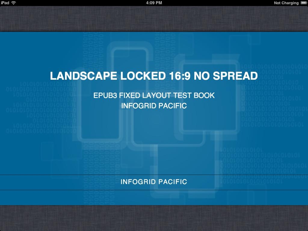
16:9 Fixed Layout, Orientation:Landscape, no spread
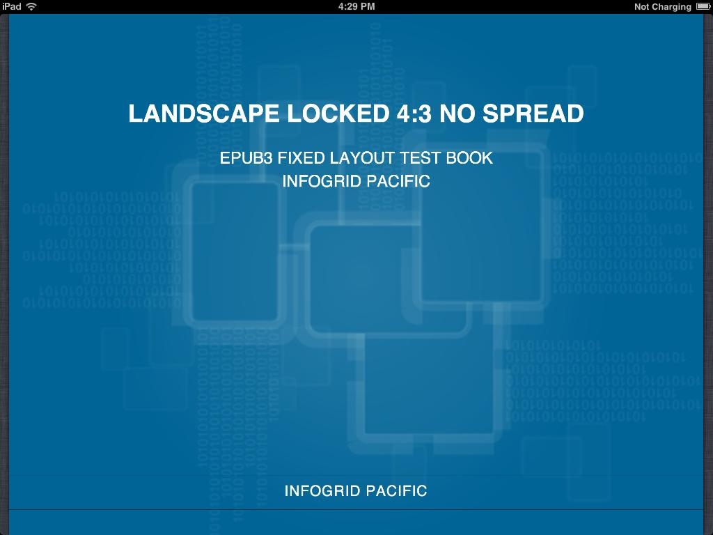
4:3 Fixed Layout, Orientation:Landscape, no spread
Right click on the images for a full size view. These are generated from the FLO ePub Test Books available here ➤
The interesting things to notice here is that with the sizing recalculation the 4:3 page in landscape doesn't quite fit. That is because the page size did not take into account the topbar.
The size to make the page to completely cover the screen is a multiple of 1004px X 768px in portrait and 748px X 1024 in landscape.
iBooks does an nice job with the 16:9 page taking it right to the screen edge and letterboxing and pillboxing nicely. So if you are designing for Android devices things still work well everywhere.
Content
iBooks wont accept an image file bigger than 2 million pixels. That's 2000px X 1000px. This means you can't use a 2048px X 1536px image because that is 3,145,728 pixels. So your background images need to be smaller and resized up if you are targeting the new iPads with a full page. Fortunately you can use the magic of CSS to do that resizing for you.
You don't have to design to the screen pixels as the pages will be transformed to fill the available viewport size as long as your aspect rati is correct. You can stick with your current page size and image strategy and maybe look at tweaking things up in size a bit.
If you are using a FLO spread the problem is smaller as the optimum page size is 1024px X 1536px per page less chrome trim.
Assuming you are doing a two page spread designed for landscape orientation, go for something like 1596px high and 986px wide to accomodate the chrome. You will have to process your images accordingly.
Print PDF to Fixed Layout Using the 2X Technique
We use a simple trick when converting a print PDF layout to Fixed layout. We convert the PDF measurements to points, multiply these by two and convert the unit to pixels.
For example if you have an A5 book 14cm x 21cm you just do this:
Width: 14/2.54 x 72 x 2 = 794px
Height: 21/2.54 x 72 x 2 = 1190px
Now all your other print PDF point measurements can be multiplied by two and applied to the fixed layout CSS. This is of course particularly easy and semi-automatic with IGP:Digital Publisher, but it is also relatively simple by hand. If your book has an 11pt/15pt design, that becomes font-size: 22px; line-height: 30px;. It's that easy.
The advantage of the two-times approach is with the new landscape and portrait locked modes in iBooks. If you use the exact resolution and zoom you can instantly see pixelation on the page because the zoom is from a screen snap of the basic resolution. By using the two-times formula you can get rid of that problem.
You can safely go larger than two times if you would like more quality "zoom" in iBooks. Just remember your image size limit.
A few tips on the "two-times" technique
Just remember to NOT use the two-times formula on images. Keep them at the original book dimensions and convert them to 96dpi. This will give you the quality you need and ensure you don't break the dreaded 2M pixel Apple law!
If your book has been very over tracked on page turns you may have problems with line-count. If you are typesetting the book and creating the fixed-layout you have that under your control. If you are inheriting a PDF from another organization you have to handle this explicitly.
We use two classes for page-turn paragraphs when they break across a page. <p class="para-runon-rw"> at the bottom of a page and <p class="para-continue-rw"> at the top of the continuing page.
The runon-rw class always get the text-align-last: right; property (this works consistently in Firefox and Webkit) and we are able to provide word-spacing styling to stretch the paragraph spacing depending on the number of words in the runon and continue paragraphs.
The continue-rw class gets a text-indent: 0; so it has no indent.
A page boundary looks like this:
<section class="Page-rw">
.....
<p class="para-runon-rw">This paragraph is relatively long
and will go across the page</p>
</section>
.
<section class="Page-rw">
<p class="para-continue-rw">boundaries and need special styling
treatment separately from standard paragraphs.</p>
....
</section>
For subtle word spacing adjustments you will have to use paragraph IDs. IGP:Digital Publisher uses 10 levels of tightness and looseness that can be inserted into the page-turn paragraphs when required. Remember you have 2X's the pixels so loosening and tightening will be bigger steps than in standard print typography.
DP Tip
While working in IGP:Digital Publisher you can also put a size transform on the galley-rw element to size it down to the physical screen size. See more about that in the Fixed Layout Setup article.
Updates
15 June 2013. Added the 2X's techniques and made some small adjustments.
4 May 2013. Updated the size table for latest products