APEX@IGP
16
OTF FONT FEATURES AND GLYPHS
OTF font features are now available for the digital content production environment. They are not used yet, but there is no reason why they shouldn't be. There are enough significant Open Source OTF fonts of quality to make it at least worth being familiar with the tools and techniques. Updated: 2012-08-05
This online article uses the following superb OTF font provided by www.SMeltery.net. It richly illustrates the value and potential of OTF font features.
MEgalopolis Extra
SMeltery is a French font factory founded in 2002 by Jack Usine to show and share his typographic investigations.
This article also uses the excellent OTF font Linux Libertine at www.linuxlibertine.org. Linux Libertine has exceptional support for international Latin languages plus a very extensive set of OTF Font Features.
Linux Libertine
Linux Biolinum
About Browsers
2012-08-25 You will only be able to see font features working in this article if you have Firefox 5+, preferrably Firefox 14, or Chrome 17+, Mac Chrome support starts with Chrome 21+. There is currently no font-feature support for Opera, Safari and Internet Explorer.
WOFF and OTF font support is broad so you should be able to see the fonts, if not the font features working in any reasonably recent browser.
This article is forward looking and about using Font Features in controlled Reading Systems using ePub3 and HTML5/CSS3. TTF/OTF/WOFF and font features can only currently be viewed in the AZARDI Desktop ePub2/3 reader.
Overview
Modern OTF fonts can be large and complex structures with hidden features that are historically controlled and accessible only through tools such as typesetting applications.
The trick with OTF Font Features is not just using them; the real challenge is knowing they exist, what features exist within a specific font, and then getting to those font-features!
OTF Font Features are a part of the CSS Fonts Module Level 3 Working Draft. The rendering frameworks that we use which support Font Features are PrinceXML for PDF production, and CSS-3 standards compliant browsers in the IGP:Digital Publisher production environment; and AZARDI Desktop (because it is Mozilla based) and AZARDI Online with the right browser. At this time font-features will not work in AZARDI Mobile for iOS or Android.
It is difficult to use font features for web pages because of the lack of cross-browser support. Another complication is the fact that due to licensing restrictions there are few elegant commercial OTF fonts that can be used from a website, or embedded in an ePub3.
The good news is there is an excellent list of Open Source OTF fonts that have excellent and serious font-feature properties.
What are OTF Font Features?
In addition to the relatively straight-forward font characters defined into Unicode character block there is a lot of "hidden data" in a font such as kerning rules and various layout and glyph substitution features. There are two big classes of font features: GSUB and GPOS.
GSUB. That is OTF font specification talk meaning Glyph Substitution, and it provides the maps of alternative glyphs available in a font if you apply the right "command".
GPOS. This is Glyph Positioning. It provides the maps for how various glyph elements should sit in relation with each other horizontally and/or vertically. Kerning is the most obvious and familiar GPOS feature and is usually on by default. In fact GPOS affects non-Latin languages far much more than the boring old ABCs.
There are a large number of language specific font features. Lots of them.
Font features can be turned on, or turned off by default in a font. Typically GPOS features are turned on by default; an example is kerning. Some GSUB features such as standard ligature substitution are recommended to be turned within a font by default.
The additional font features can be difficult to access, display and use independently from a typesetting program. While many font utilities show all of the characters, there are none that show the font-feature maps clearly. Even InDesign has a fairly muggy interface for accessing alternative glyphs.
Taking a Look at Font Features
Let's take a look at just some of the things MEgalopolis can do before more explanation. In the following examples, the top paragraph is the standard font, the bottom with the font feature applied.
MEgalopolis at Work
You will only be able to view these font features in a very recent web browser. Normal characters are black followed by font-feature enhanced characters in pacific green.
Characters
ABCDEFGHIJILMONPQRSTUVWXYZ abcdefghijklmnopqrstuvwxyz 1234567890
Ligatures-liga
A nice set of standard ligatures
ffb ffb fff fff ffh ffh ffj ffj ffk ffk ffl ffl fft fft fb fb ff ff fh fh fj fj fk fk fl fl ft ft
Discretionary Ligatures-dlig
Here we have discretionary ligatures gone crazy. You can add them where you want them.
EE EE AT AT CA CA CC CC CE CE CO CO CU CU EE EE EL EL FA FA FE FE FF FF FO FO FU FU HE HE KA KA ME ME LA LA LE LE LL LL LO LO LU LU OO OO NN NN SH SH SK SK SL SL SM SM SU SU Sh Sh Sk Sk Sl Sl RA RA RE RE RO RO RU RU TE TE TH TH TT TT Th Th ^| ^| ch ch ck ck ct ct |^ |^ gt gt sk sk st st ry ry tt tt
Old Style Numbers
If you like your numbers old, they are just a CSS style away.
11223344556677889900
Some Final Forms
Final forms are designed to hand both language forms where final character use a different glyph, and for artistic flourish.
Digital Content is groovy
SS06
Stylist Set 06. OTF leaves plenty of room for the font designer to exercise their genius so we can end with a flourish.
a a j j
vswvx vswvx
Linux Libertine at Work
You will only be able to view these font features in a very recent web browser. Normal characters are black followed by font-feature enhanced characters in pacific green.
Characters
ABCDEFGHIJILMONPQRSTUVWXYZ abcdefghijklmnopqrstuvwxyz 1234567890
Ligatures-liga
fft fft ffk ffk ffj ffj ffh ffh ffl °F °F °C °C fft ffk ffj ffh ffl ft fk fj fb fh f fl ff ſl ſſ ſh fs ſs ft ſt ?! ?? .. ... Qu Q Qu Th Th !? !? !! !! tt tt
Small-caps from Capitals c2sc
Only capitals are turned into small-caps with this feature
ABCDE abcde ABCDE abcde
ABCDEFGHIJKLMNOPQRSTUVWXYZ IGP:DIGITAL PUBLISHER IS HOT!
Old Style Numbers
Here is those boring OSNs again.
11 22 33 44 55 66 77 88 99 00
Alternate Annotations
(1) (1) (2) (2) (3) (3) (4) (4) (5) (5) (10) (10)
Fractions
1/2 1/2 3/4 3/4 7/16 7/16 19/32 19/32 45/64 45/64
W3C Font Features
There is a large list of features available in OTF fonts. The full list is included at the bottom of this article for those interested in the (massive) dimensions of layout and presentation problems OTF fonts are capable of addressing; language by language.
Common alphabet font features are ligatures, discretionary ligatures,fractions, old-style numbers and small-caps. Most fonts have important features like kerning and ligatures on by default. They have to be turned off if you don't want to use them.
The W3C is currently working on handling these special cases with the font-variant property It looks ugly. Very ugly.
The proposed values will be one of the following. This is an interesting use of the "font-variant" property considering it has been stuck on small-caps more or less forever. For those who can or enjoy reading CSS gumdrops....
Name: font-variant
Value:
normal | inherit
| [ <common-lig-values> |
| <discretionary-lig-values> |
| <historical-lig-values> |
| <contextual-alt-values> |
| stylistic(<feature-value-name>) |
| historical-forms |
| styleset(<feature-value-name> [, <feature-value-name>]*) |
| character-variant(<feature-value-name> [,<feature-value-name>]*) |
| swash(<feature-value-name>) || ornaments(<feature-value-name>) |
| annotation(<feature-value-name>) |
|[ small-caps | all-small-caps | petite-caps | all-petite-caps | titling-caps | unicase ] |
| <numeric-figure-values> |
| <numeric-spacing-values> |
| <numeric-fraction-values> |
| ordinal |
| slashed-zero |
| <east-asian-variant-values> |
| <east-asian-width-values> |
| ruby ]
That is a serious western oriented sub-set of the font-features, with a passing nod at CJK down the bottom. It ignores about, oooh... 80% of the actual font-features, but most of them are enabled by default, it just means they can't be turned off.
Meanwhile to view font features in a browser you can use one of the following CSS properties. This example uses the ligatures (liga) property.
font-feature-setting: (liga) 1;
-webkit-font-feature-settings: "liga" 1;
-ms-font-feature-settings: "liga" 1;
-o-font-feature-settings: "liga" 1;
-moz-font-feature-settings: "liga=1";
-moz-font-feature-settings: "liga" 1;
font-variant: prince-opentype(liga);
Out of this list only webkit in Chrome, Firefox and PrinceXML actually work. PrinceXML has supported this feature since version 7, and Firefox since Version 9. Other browser has come on recently so this is well supported in the rendering engines in which we should be interested.
It is straight-forward CSS to apply these features.
<p class="liga">It's official now</p>
.liga {
    -webkit-font-feature-settings: "liga";
    -ms-font-feature-settings: "liga";
    -o-font-feature-settings: "liga";
    -moz-font-feature-settings: "liga=1";
    -moz-font-feature-settings: "liga";
    font-variant: prince-opentype(aalt);
    font-feature-setting: "liga" 1;
    }
Using features such as discretionary ligatures (dlig), swashes (swsh) or Stylistic Sets (ss01) needs a little more detailed work because the style is probably only going to be applied to a single character, or a small sub-set of characters.
Production Technology
OTF fonts are complicated things. So complicated in fact that only Adobe InDesign and Illustrator can even show the alternative glyphs that can be applied for a particular font character... that is until the new IGP:Digital Publisher font manager was released in June 2012. IGP:Font Manager 2 rips the lid off fonts, glyphs and font features in a new and exciting way. It make font features easy to use in a digital-content production and packaging environment. Importantly due to the magic of Design Profiles you can use different fonts and font features in multiple print editions and ePubs all generated from the same
With IGP:Font Manager 2 you can view every character and all the glyphs available within any font. We have made a couple of Open Source fonts available for full inspection. You can see them by clicking on the font name (this opens a stand-alone web page. You will have to use return to come back to this page. Alternatively right-click and open in a new window or tab):
LInux LIberation Regular. The standard weight font-face which shows the extensive European and East European support this font both in characters and font features.
MEgalopolis by SMeltery.net. A great font and a great way to easily see a good number of font features in use.
Reading Devices and Browsers
With the exception of AZARDI, support for the CSS font-feature-settings property is non-existent in Reading Systems.
It is now well supported in Firefox 8+, Chrome 18+ and PrinceXML. The early Firefox albeit both with custom properties at present because AZARDI is built on the Mozilla engine (Firefox) rather than Webkit (Android, iOS and others).
It's a long hard journey for production. We patiently wait for browser engine implementors to get around to supporting these features.
Our Approach and Use
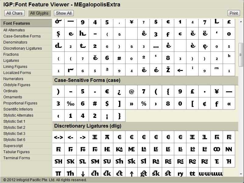
The full font character set and all of the font property character to glyph mapping used in a font can be seen and explored using the IGP:Font Manager 2 Glyph Viewer.
In the screen grab of the SMeltery MEgapolis fot you can see the characters and font features are two clearly differentiated sets of properties. The technical names exposed to give a little familiarity to the various blocks and properties and makes it easy to use a value in an XHTML /CSS document when required. Humans may be able to remember a few of these, but the whole list is somewhat intimidating.
If you are working with a very complex OTF font the font feature viewer is invaluable. You can also print the full character and font-feature table maps.
Summary
Fonts and glyphs have always been important for print production. The typography and layout discussion is getting louder for digital-content and "typography" is becoming an issue of increasing interest, and importance for e-book production.
Any publisher can immediately take advantage of this powerful CSS-3 feature by using standard fallback CSS statements. When readers are upgraded and can support this feature, it will then "kick-in". Of course this is not an option where the font feature is about language features, rather than presentation features.
It is important that digital content typography doesn't mimic print typography, and that is a real challenge for X-Y designers. Digital books do not need to all become "fixed-layout" to be distinctive and well designed.
IGP:Digital Publisher puts print and digital formats on an equal footing. They are "just" output formats (but the reason the product exists!). The digital content world is becoming interesting as the capabilities of digital presentation converges with paper presentation and then moves on past paper with interactivity and more.
Publishers are going to have to wait and see what reading devices do in the future, but meanwhile look at the samples we have created to show just some of the possibilities. Because AZARDI is the only reading device available that can exploit fonts to the fullest and switch between fixed and flow layout effortlessly, you will have to use AZARDI to see the typographic features in their full majesty. That is the reward for reading this far.
OTF Font Features Organized by Language Group
There are a lot of font features, many of which apply to specific languages or language groups. This set of glossary lists may make it easier to understand the value font features deliver. The term in parenthesis is the standard recommendation whether a feature is active, off or conditional within a font.
No language
.aalt Access All Alternates. Lang: none
.afrc Alternative Fractions. Lang: none (off)
.ccmp Glyph Composition / Decomposition. Lang: None (active)
.clig Contextual Ligatures. Lang: None (active)
.cv01-99 Character Variants. Lang: None (off)
.dlig Discretionary Ligatures. Lang: None (off)
.dnom Denominators. Lang: None (on with frac)
.frac Fractions. Lang: None (off)
.fwid Full Widths. Lang: Monospaced forms (off)
.hist Historical Forms. Lang: None (off)
.kern Kerning. Lang: None (active)
.lfbd Left Bounds. Lang: None (on with opbd)
.liga Standard Ligatures. Lang: None (active)
.lnum Lining Figures. Lang: None (off)
.locl Localized Forms. Lang: None (active)
.ltra Left-to-right alternates. Lang: Left to right (none)
.ltrm Left-to-right mirrored forms. Lang: Left to right
.numr Numerators. Lang: None (on with frac)
.onum Oldstyle Figures. Lang: None (off)
.opbd Optical Bounds. Lang: None (active)
.ornm Ornaments. Lang: None (off)
.pnum Proportional Figures. Lang: None (off)
.rtbd Right Bounds. Lang: None (on with opbd)
.salt Stylistic Alternates. Lang: None (off)
.sinf Scientific Inferiors. Lang: None (off)
.size Optical size. Lang: None (active)
.ss01-20 Stylistic Set 1. Lang: None (off)
.subs Subscript. Lang: All scripts (off)
.sups Superscript. Lang: All scripts (off)
.titl Titling. Lang: None (off)
.tnum Tabular Figures. Lang: None (off)
.zero Slashed Zero. Lang: Scripts that use 0. (off)
Latin and Alphabet forms
.calt Contextual Alternates. Lang: Not Ideographs (active)
.case Case-Sensitive Forms. Lang: European (optional)
.cswh Contextual Swash. Lang: Not Ideographs (off)
.c2pc Petite Capitals From Capitals. Lang: European (off)
.c2scSmall Capitals From Capitals. Lang: European (off)
.fina Terminal Forms. Lang: Alphabetic (active)
.hlig Historical Ligatures. Lang: None (off)
.init Initial Forms. Lang:Alphabetic (active)
.ital Italics. Lang: Latin (if available)
.medi Medial Forms. Lang: Alphabetic (active)
.mgrk Mathematical Greek. Lang: Fonts with Greek (off)
.nalt Alternate Annotation Forms. Lang: CJKV European (off)
.ordn Ordinals. Lang: Latin (off)
.pcap Petite Capitals. Lang: European (off)
.smcp Small Capitals. Lang: European (off)
.swsh Swash. Lang: Not Ideographs (off)
.unic Unicase. Lang: European (off)
Indic and South East Asian Scripts
.abvf Above-base Forms. Lang: Khmer
.abvm Above-base Mark Positioning. Lang: Indic
.abvs Above-base Substitutions. Lang: Indic
.akhn Akhands. Lang: Kannada, Indic
.blwfBelow-base Forms. Lang: Indic
.blwm Below-base Mark Positioning. Lang: Indic
.blws Below-base Substitutions. Lang: Indic
.cjct Conjunct Forms. Lang: Indic/Devanagari
.cfar Conjunct Form After Ro. Lang: Khmer
.dist Distances. Lang: Indic
.expt Expert Forms. Lang: Japanese
.half Half Forms. Lang: Indic
.haln Halant Forms. Lang: Indic
.nukt Nukta Forms. Lang: Indic
.pref Pre-Base Forms. Lang: Khmer, Myanmar, Indic
.pres Pre-base Substitutions. Lang: Indic
.pstf Post-base Forms. Lang: Khmer, Indic
.psts Post-base Substitutions. Lang: Indic, alphabetic
.rphf Reph Forms. Lang: Indic
.rkrf Rakar Forms. Lang: Indic
.rlig Required Ligatures. Lang: Indic
.vatu Vattu Variants. Lang: Indic
CJKV
.cpct Centered CJK Punctuation. Lang: Chinese
.halt Alternate Half Widths. Lang: CJKV
.hkna Horizontal Kana Alternates. Lang: Kana
.hngl Hangul. Lang: Korean
.hojo Hojo Kanji Forms (JIS X 0212-1990 Kanji Forms). Lang: Kanji
.hwid Half Widths. Lang: CJKV
.jp78 JIS78 Forms. Lang: Japanese
.jp83 JIS83 Forms. Lang: Japanese
.jp90 JIS90 Forms. Lang: Japanese
.jp04 JIS2004 Forms. Lang: Kanji
.ljmo Leading Jamo Forms. Lang: Hangul
.nalt Alternate Annotation Forms. Lang: CJKV European
.nlck NLC Kanji Forms. Lang: Kanji
.palt Proportional Alternate Widths. Lang: CJKV
.pkna Proportional Kana. Lang: Japanese
.pwid Proportional Widths. Lang: CJKV
.ruby Ruby Notation Forms. Lang: Japanese
.qwid Quarter Widths. Lang: None
.smpl Simplified Forms. Lang: Chinese, Japanese
.tjmo Trailing Jamo Forms. Lang: Hangul
.tnam Traditional Name Forms. Lang: Japanese
.trad Traditional Forms. Lang: Chinese, Japanese
.twid Third Widths. Lang: CJKV
.valt Alternate Vertical Metrics. Lang: Vertical Modes
.vert Vertical Writing. Lang: Vertical Modes
.vhal Alternate Vertical Half Metrics. Lang: CJKV
.vjmo Vowel Jamo Forms. Lang: Hangul
.vkna Vertical Kana Alternates. Lang: Kana
.vkrn Vertical Kerning. Lang: None
.vpal Proportional Alternate Vertical Metrics. Lang: CJKV
.vrt2 Vertical Alternates and Rotation. Lang: Vertical modes
Right to Left and Semitic
.cpsp Capital Spacing. Lang: Not connecting (Arabic)
.curs Cursive Positioning. Lang: None
.falt Final Glyph on Line Alternates. Lang: Cursive script
.fin2 Terminal Forms #2. Lang: Syriac
.fin3 Terminal Forms #3. Lang: Syriac
.isol Isolated Forms. Lang: Cursive Script
.jalt Justification Alternates. Lang: Cursive Script
.mark Mark Positioning. Lang: None
.med2 Medial Forms #2. Lang: Syriac
.mkmk Mark to Mark Positioning. Lang: None
.mset Mark Positioning via Substitution. Lang: Arabic
.rand Randomize. Lang: Arabic, Syriac
rtla Right-to-left alternates. Lang: Right to Left
.rtlm Right-to-left mirrored forms. Lang: Right to Left
References
MEgalopolis Extra font www.SMeltery.net
OTF Font features in detail http://www.microsoft.com/typography/otspec/features_ae.htm
PrinceXML Rendering Enging www.PrinceXML.com