APEX@IGP
38
Fixed Layout ePub3 to PDF
This article is a real-world experience tutorial on created PDF from ePub3 fixed layout code using IGP:Digital Publisher and PrinceXML as the PDF rendering engine: Updated: 2013-06-25.
The world is all a-twitter about PDF to fixed layout ePub. We flipped the "problem" and created PDF from an ePub3 document HTML/CSS code. It's actually very easy with the right tools and a bit of planning.
Objectives
We wanted to create extended PDF brochures of our products and services, but also want to put our money where our posts are and create fixed layout ePub3 versions as well using tools that are usually reserved for print and ebook production. We also wanted to have a reflowable ePub3 available which could support extended text.
We have a number of brochures to produce, but the first are: IGP:Digital Publisher (DP) and AZARDI:Content Fulfilment (ACF).
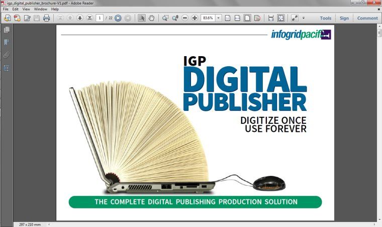
The PDF redition of the brochure cover. This was created with PrinceXML. Notice there is no shadow on the text.
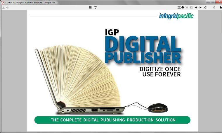
The ePub3 rendering of the brochure cover in AZARDI notice the text shadow is working in this rendition.
Setup
The print PDFs had to be A4 and were happy with the ePub3 being the same aspect ratio. Of course we all remember from our school days the aspect ratio of A4 (or A-anything) is 1.41414 (repeat to infinity). Generally 1.414 is enough accuracy.
The CSS was a direct translation of 210mm x 297mm to 96dpi pixels per inch. The simple arithmetic (in landscape) is:
Width: 297mm / 25.4 * 96 = 1123px (rounded)
Height: 210mm / 25.4 * 96 = 794px (rounded)
In fact for easier arithmetic with borders we pragmatically turned the 1123 into 1124px and hope no-one notices the extra pixel. 1124px X 794px is a pretty good size for most tablets and AZARDI Desktop.
After a print test or two we found that with our standard Samsung/HP/Canon printer combo 30px border around the page was enough to keep us clear of the non-printing area of modern printers. However we set the border to 40px for art's sake in the ACF brochure.
Layout design
From this point is was simply a matter of designing the layout and variations on a theme. The objective was to have pages that were designed for the content they were presenting while keeping the pages thematic.
The standard design is a header, a prominent title and three absolutely positioned blocks of equal size placed horizontally in row. Because we smartly used IGP:FoundationXHTML we bushwacked the textbook chapter section blocks and used them for easy page start-layout consistency. The basic layout looks like this:
<div class="body-rw Section-rw ">
    <div class="text-block-rw general-rw">
        ...header text and image ....
    </div>
    <div class="title-block-rw">
        <h1>Page title</h1>
    </div>

    <div class="introduction-rw"> The left block</div>

    <div class="section-opening-rw"> The centre block</div>

    <div class="section-closing-rw">The right block</div>

    <p class="bodytext8-rw">ACF Brochure Bottom arrowbar</p>
</div>
The css for this was easy:
.introduction-rw, .section-opening-rw,
.section-closing-rw {
    position: absolute;
    width: 420px;
    }
/*Section Opening*/
.introduction-rw {
    position: absolute;
    left: 40px;
    top: 180px;
    width: 340px;
    }
.introduction-rw p {
    font-size: 18px;
    line-height: 22px;
    font-weight: 300;
    }
.introduction-rw p.firstpara-rw {
    font-size: 22px;
    line-height: 26px;
    font-weight: 300;
    }
.section-opening-rw, .section-closing-rw {
    position: absolute;
    top: 180px;
    left: 410px;
    width: 320px;
    font-size: 15px;
    line-height: 20px;
    font-weight: 300;
    text-align: left;
    hyphens: none;
    }
.section-closing-rw {
    left: 760px;
    }
The fonts for the document were declared using an IGP:Digital Publisher Font Scheme.
Because the basic blocks were all specified with CSS class selectors any over-rides for position or other styling was easily made with ID Selectors which take precedent in the CSS cascade.
The Fonts
We needed a variety of font weights to give a blend of gravitas, eye-focus, readability and play. We could have gone with anything but in celebration of Adobe actually giving something away we went with the Adobe Source Sans font-family.
We also needed to have open fonts that could be embedded into the ePub3 without any rights issues.
Source Sans has six font weights that work with CSS-3 systems. In their words that is Extra-light, light, regular, semi-bold, bold and black. In CSS-3 terms that is 200, 300, 400, 600, 700 and 900.
We decided to do it all with the one font-family although the black is a little 800 (extra-bold) rather than a real black. We lived with it!
Designing with font characters
Of course when working with font-sizes in pixels there are no 0.25px as everything is rounded up or down to the nearest pixel. That meant consciously designing to pixel integers with font-size and line-height.
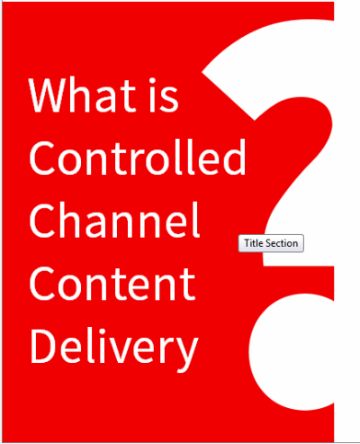
Font design and layout were important as was file-size. That is why page items like the question-mark example on the right were done using fonts only. This is simply manipulating the font-size and positioning. A little tricky is using line height which of course contains the descender space. You can make the line-height anything you like so typically this type of character gets a font-size of 900px and a line-height of 500px to give easier control
#ccc0 .style6-rw {
    display: block;
    position: absolute;
    left: 280px;
    bottom: 70px;
    color: rgba(255, 255, 255, 1);
    font-size: 900px;
    line-height: 500px;
    font-weight: 900;
    }
This was an inline <span> style converted to a block because we needed the text in the right position to make the reflowable text version and to export Word files for translation to Spanish and Chinese.
CSS Geometry
There are a lot of shapes that can simply be created with CSS borders to make a very useful set of fixed layout geometical designs. Check out www.CSSShapes.com. If you use images or SVG for this the production effort can increase needlessly. The ACF brochure has a running arrow line at the bottom of the page that looks like this:
THE PROMO TEXT HERE
It was done like this:
<p class="bodytext8-rw">The Promo text</p>
/* CSS */
.bodytext8-rw {
display: block;
position: absolute;
bottom: 30px;
left: 80px;
right: 80px;
height: 50px;
font-size: 25px;
line-height: 50px;
text-align: center;
background-color: rgb(240, 0, 0);
color: rgb(255, 255, 255);
font-weight: 600;
}
.bodytext8-rw:before {
content: ' ';
position: absolute;
left: 0;
top: 0;
border-color: rgb(240, 0, 0) rgb(240, 0, 0) rgb(240, 0, 0) transparent;
border-style: solid;
border-width: 25px;
height: 0;
width: 0;
border-width: 25px 0 25px 25px;
margin: 0 0 0 -24px;
}
.bodytext8-rw:after {
content: ' ';
margin: 0 -29px 0 0;
border-bottom: 25px solid transparent;
border-left: 30px solid rgb(240, 0, 0);
border-top: 25px solid transparent;
position: absolute;
right: 0;
top: 0;
}
It is easy to directly author into a document using IGP:Digital Publisher. It is an authoring, editing, tagging and design environment. The page templates are simple and available on demand. So writing long and editing down to fit the blocks was the general approach to creating these documents.
All the designing and CSS editing was carried out in IGP:Reader using the online fixed layout mode.
When that was finished the CSS was copied to the print CSS and the PDF instantly sparkled into life. IGP:Digital Publisher uses the PrinceXML PDF rendering engine. It has comprehensive CSS support with of course extensions for print layout. There are minor feature differences with the CSS between PrinceXML and the AZARDI ePub3 fixed-layout presentation window. For example PrinceXML doesn't yet support text shadow. These differences were taken into account during the design phase.
Summary
Going from HTML/CSS prepared for fixed layout ePub3 to PDF is a straight-forward thinking-inversion. It is another option that HTML5/CSS-3 brings to the table for publishers.
The entire front-list production thinking at present is from a DTP application to PDF and then to ePub3. There is a business humming around retro-digitizing PDFs and converting them into ePubs.
This type of production is easier with IGP:Digital Publisher which has all the tools built-in. And is always ready to output any required format. This exercise was a brain change in the way the tools are used (designing for fixed layout ePub3 first) rather than anything radical with the tools.
There are a number of HTML/CSS rendering engines available. IGP:Digital Publisher uses PrinceXML from Yes Logic!.
References
IGP:Digital Publisher PDF Brochure
IGP:Digital Publisher ePub3 Brochure
AZARDI:Content Fulfilment PDF Brochure